Mobile devices have become one of the factors of dramatic changes in e-commerce. As more and more consumers turn to their smartphones and tablets to make purchases, e-commerce companies must adapt their platforms to meet the needs of this growing mobile audience. Statista predicts that mobile commerce sales will grow to an impressive $3.44 trillion by 2027. This article looks at seven best practices for mobile e-commerce, from understanding the mobile shopping landscape to using mobile-first design principles. By implementing these strategies, you can improve user experience, increase conversion rates, and stay ahead of the competition.

Understanding the Mobile Shopping Landscape
Before diving into best practices, it is essential to understand the mobile shopping landscape. Mobile devices are now the primary means of internet access, and this trend is expected to continue growing. As a result, mobile e-commerce has become a significant driver of online sales. Therefore, optimizing your website for mobile devices is crucial to meet the modern consumer’s demands.
With the increasing popularity of smartphones and tablets, consumers can now shop from their desktop computers. They can now browse and make purchases on the go, whether waiting for a bus or relaxing at a coffee shop. This shift in consumer behavior has created a new era of convenience and accessibility in online shopping.

Moreover, mobile shopping presents distinct benefits for both consumers and businesses. For consumers, it means the power to compare prices, peruse reviews, and make well-informed decisions at their fingertips. For businesses, it’s a gateway to a broader audience and increased sales through targeted mobile marketing strategies.
M-Commerce Best Practices for Your Business
To make the most of this direction, it’s essential to implement best practices that will help your business adapt to changes in consumer behavior and stay ahead of the competition. Let’s look at the critical approaches to M-Commerce that will help you create a convenient and practical mobile experience for your customers.
Understanding Mobile User Behavior in E-commerce
To develop an effective mobile e-commerce strategy, it is essential to understand how mobile users behave when shopping online. Mobile users tend to have shorter attention spans and are likelier to engage in impulse purchases. Therefore, optimizing your mobile e-commerce platform to capture and retain their attention is crucial.

Use mobile analytics to identify popular products and optimize their visibility on mobile devices. Implement features like one-click purchasing, wish lists, and personalized recommendations to facilitate quick and seamless transactions. By understanding mobile user behavior, you can tailor your mobile e-commerce platform to meet their needs and maximize conversions.
Leveraging Mobile-First Design Principles
Mobile-first design is a philosophy that prioritizes mobile devices over desktop computers when designing websites and applications. With mobile devices becoming the primary means of internet access, it is crucial to adopt a mobile-first mindset to deliver a superior user experience.

When designing your mobile e-commerce platform, consider smaller screen sizes, touch-based navigation, and limited bandwidth. Optimize images and content for fast loading times and ensure your website is responsive across different devices and screen sizes. By incorporating mobile-first design principles, you can create a seamless and engaging shopping experience for your mobile audience.
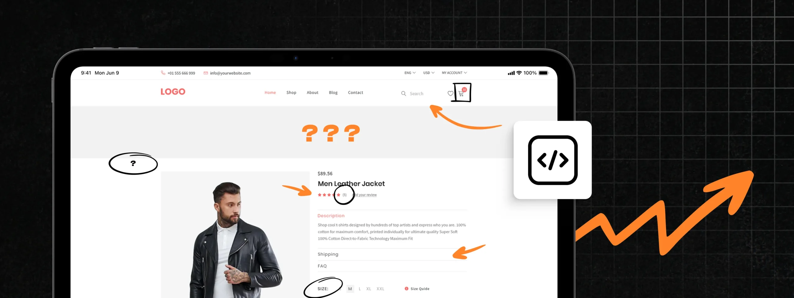
Optimizing Your Website for Mobile Devices
Key elements include mobile-responsive layouts, larger touch targets, and simplified navigation. A poorly optimized site can frustrate users, leading to higher bounce rates and lost sales. Additionally, mobile optimization enhances search engine rankings, as Google prioritizes mobile-friendly sites, boosting your visibility and attracting more organic traffic.
Optimize images, minify code, and leverage browser caching to reduce loading times. Implement a content delivery network (CDN) to distribute your website’s assets across multiple servers worldwide, ensuring faster loading times for users regardless of their geographical location. A fast-loading website enhances the user experience and improves conversion rates and search engine rankings.
Analyzing Mobile Analytics for Continuous Improvement
Once you have optimized your website for mobile devices, it is essential to analyze mobile analytics to identify areas for improvement. You can gain valuable insights into mobile user behavior by tracking key metrics such as bounce rates, conversion rates, and average session duration.
Mobile analytics can also help you understand the effectiveness of your mobile marketing campaigns. You can optimize your advertising strategies and allocate your budget by tracking metrics such as click-through and conversion rates from mobile ads.
Mobile-Friendly Checkout Process
The checkout process is a critical stage in the buying journey. A clunky or complicated checkout process can lead to cart abandonment and lost sales. Therefore, ensuring your mobile checkout process is user-friendly and optimized for mobile devices is vital.

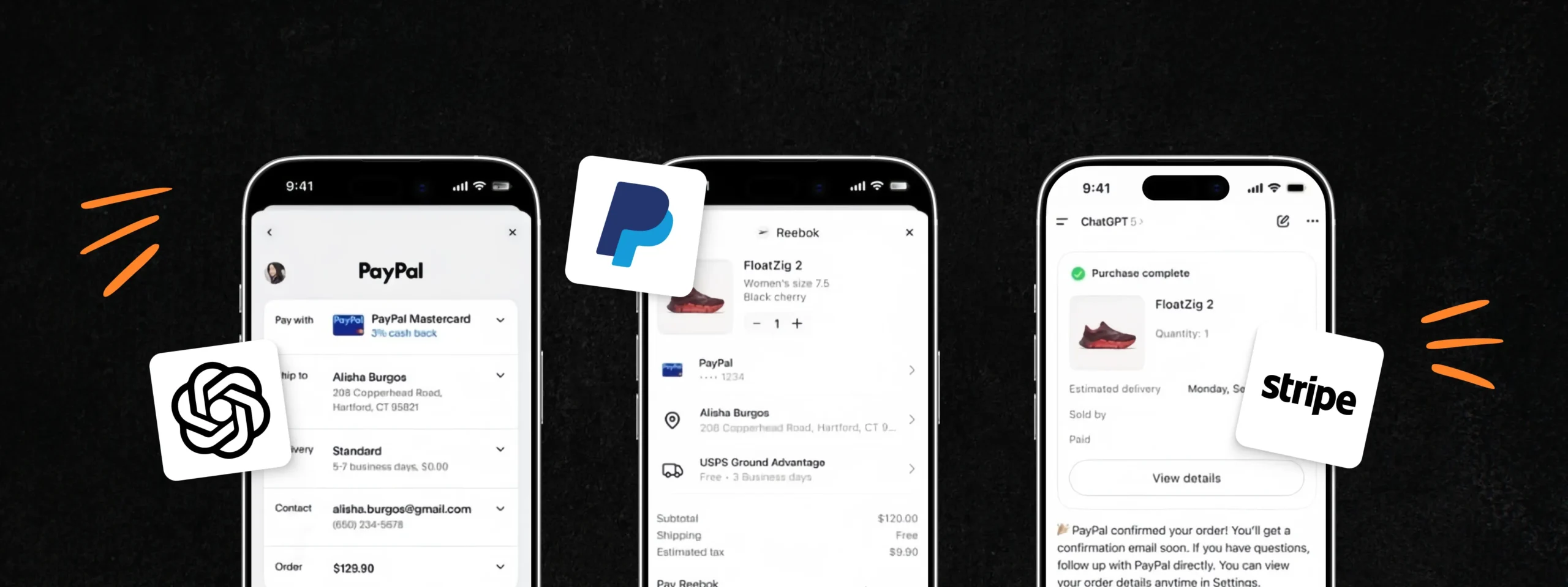
Simplify the checkout form by reducing the number of fields required. Incorporate autofill functionality to streamline the process and eliminate the need for manual data entry. To cater to user preferences, offer multiple payment options, including digital wallets and mobile payment platforms. By providing a seamless and user-friendly checkout experience, you can increase conversion rates and reduce cart abandonment.
Commerce Solutions for Mobile
Regarding mobile e-commerce solutions, it can take time to make a clear choice, so we want to introduce you to some famous and practical solutions. They offer both adaptations for mobile users of the leading site and the development of mobile applications.
Magento Mobile Commerce Solution is a robust platform that allows the creation of responsive mobile applications and mobile versions of sites for Magento-based online stores. It offers a range of tools to enhance the mobile shopping experience, including support for progressive web applications (PWA), optimization of page load speed, user-friendly navigation, and a streamlined purchase process. The platform’s integration with various payment systems and support for push notifications further enhance its capabilities.

Shopware Mobile Commerce Solution is a comprehensive toolset for creating mobile versions of online stores and mobile applications on the Shopware platform. It includes progressive web applications (PWAs) that enable the creation of fast, convenient, and effective mobile websites. Shopware’s responsive design, which automatically adjusts to different screen sizes, and its simplified mobile device interface ensure a seamless user experience. This platform allows for integrating mobile payment solutions and ensures fast page loading, enhancing the user experience. In addition, support for push notifications and a convenient checkout process helps increase conversions and engage mobile users.

Summary
In conclusion, adapting your e-commerce platform for a growing mobile audience is crucial to succeed in today’s digital landscape. By understanding the mobile shopping landscape, optimizing your website for mobile devices, and leveraging mobile-first design principles, you can deliver a superior user experience and drive conversions. Stay updated with future trends in mobile e-commerce, leverage mobile commerce solutions like Magento and Shopware, and explore the power of mobile apps and tailored mobile applications. Understand mobile user behavior, optimize checkout, and implement strategies to boost conversions. Following these seven best practices, you can thrive in mobile e-commerce and connect with the ever-growing mobile audience.