E-commerce today is fiercely competitive. It is paramount to capture the attention of online shoppers and convert them into loyal customers. Success comes from more than just great products. It also comes from providing a great user experience (UX) and a visually appealing interface (UI).

Conducting a thorough UX/UI audit can significantly increase your conversion rates and elevate your website into a highly effective sales platform. By implementing impactful UX/UI practices, you can:
- Improve user engagement. Keep visitors interested and help them easily navigate your site.
- Reduce obstacles. Simplify the buying process to remove anything that might discourage customers.
- Build trust and credibility. Create a professional and reliable brand image.
- Increase customer satisfaction. Provide a smooth and enjoyable shopping experience.
Do you know the best UX/UI practices for increasing conversions? Ready to boost your e-commerce business? Our expert UX/UI audit can help you identify areas for improvement and implement strategies that drive conversions. Keep reading!
What are Conversion Rate Optimization, UI, and UX?
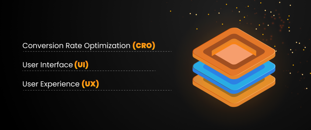
Creating the perfect burger can be compared to Conversion Rate Optimization (CRO), User Interface (UI), and User Experience (UX). How? Each part plays a crucial role in enhancing the overall experience, just like the layers of a delicious burger.

Conversion Rate Optimization (CRO)
Conversion Rate Optimization (CRO) is comparable to the meticulous process of customizing the ingredients of a burger to make it absolutely irresistible. It involves the systematic refinement of your website to prompt a higher percentage of visitors to take desired actions, whether completing a purchase, subscribing to a newsletter, or engaging in any other valuable interaction. Just as achieving the perfect balance of flavors in a burger can elevate its appeal, CRO entails fine-tuning the website’s content, design, and functionality to maximize the rate of conversions effectively. This iterative and data-driven approach aims to enhance user experience and drive meaningful results for the business.
UI
A website’s user interface (UI) is analogous to a burger’s presentation upon serving. It encompasses the visual aspects of the website, such as the color scheme, typography, button design, and overall layout. A well-crafted UI can be likened to a meticulously assembled burger, where every element is visually appealing and contributes to easy navigation. On the contrary, a cluttered or visually confusing UI can lead visitors to lose interest, much like an unappetizing burger that fails to entice anyone.
UX
Think of UX like the experience of eating a delicious burger – it’s all about how satisfying and easy it is to enjoy. A top-notch UX ensures that your website is super user-friendly and offers a seamless journey for your visitors. If users can’t find what they’re looking for or run into trouble navigating your site, they’re likely to bounce, just like someone would ditch a messy burger. Good UX means everything works smoothly and intuitively, making visitors stay longer and more involved.
Optimize all three elements on your website to create a digital experience that is as satisfying as a perfectly made burger. Visitors will enjoy the experience, stay longer, and be far more likely to convert into customers.
Boost your bottom line with a UX audit!
IT Delight team will identify usability issues, optimize your website for conversions, and enhance your brand reputation.
6 Proven UI/UX Conversion Rate Optimization Tips
Enough theory, let’s get to the practical stuff. Let’s explore specific steps to increase conversions on your website. We’ve come up with six proven strategies that really work to help you achieve your desired results.
1. Understanding User Behavior
What is:
Understanding user behavior means gaining insights into how visitors interact with your website. This involves knowing what they click on, how long they stay on pages, and which steps they take before converting (or leaving). It’s about digging into the “why” behind user actions to improve their experience.

How to improve:
Understand your users’ needs by conducting surveys, interviews, or usability tests. Analyze data using tools such as Google Analytics or Heatmaps to identify where users are most engaged or where they drop off. Use this information to customize your website to meet their expectations and enhance the user experience.
2. Simplifying Navigation
What is:
When it comes to simplifying navigation on your website, it’s important to focus on organizing your site’s structure. By arranging your content logically and user-friendly, visitors can quickly locate the information they seek without any unnecessary hassle. It’s crucial to avoid a cluttered or confusing layout, as it can lead to frustration among users, potentially causing them to leave your site.

How to improve:
Conduct surveys, interviews, or usability tests to understand your users’ needs. Analyze data using tools such as Google Analytics or Heatmaps to identify where users are most engaged or where they drop off. Use this information to customize your website to meet users’ expectations and enhance the user experience.
3. Clear Call-to-Actions (CTAs)
What is:
A clear call to action (CTA) is vital in websites and marketing materials. It can be a button or a message that tells users to take a specific action, like making a purchase or signing up for a service. CTAs help to encourage visitors to interact with a website or marketing content. Businesses can significantly improve their chances of converting visitors into customers or leads by offering a clear and compelling call-to-action (CTA).

How to improve:
Conduct A/B tests to compare different versions of CTAs, page layouts, or other elements to identify the most effective design.Strong, action-oriented language is important to effectively encourage users to take the desired action. In addition, eye-catching design elements can grab attention and appeal to users. It’s important to make sure that calls to action (CTAs) are easily visible to encourage user engagement.
4. Mobile Responsiveness
What is:
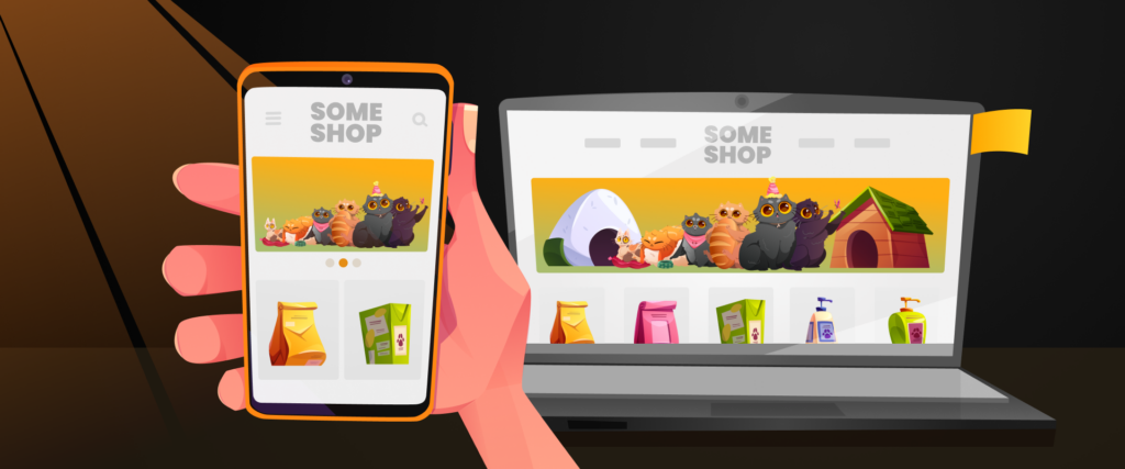
Mobile responsiveness means that a website can automatically adapt its layout, content, and features to provide a great user experience on different mobile devices like smartphones and tablets. This ensures that visitors can easily use the website no matter what device they’re using. By using responsive design, your website can meet the varied needs of mobile users and provide a smooth browsing experience.

How to improve:
Improve mobile usability by making sure that your website loads quickly, images resize properly, and buttons are easy to tap on smaller screens. Use touch-friendly elements, streamline navigation, and reduce scrolling to enhance the mobile user experience. This involves designing a mobile-friendly layout that maintains smooth and intuitive navigation. A well-designed mobile experience can reduce high bounce rates and increase conversions.
5. Loading Speed Optimization
What is:
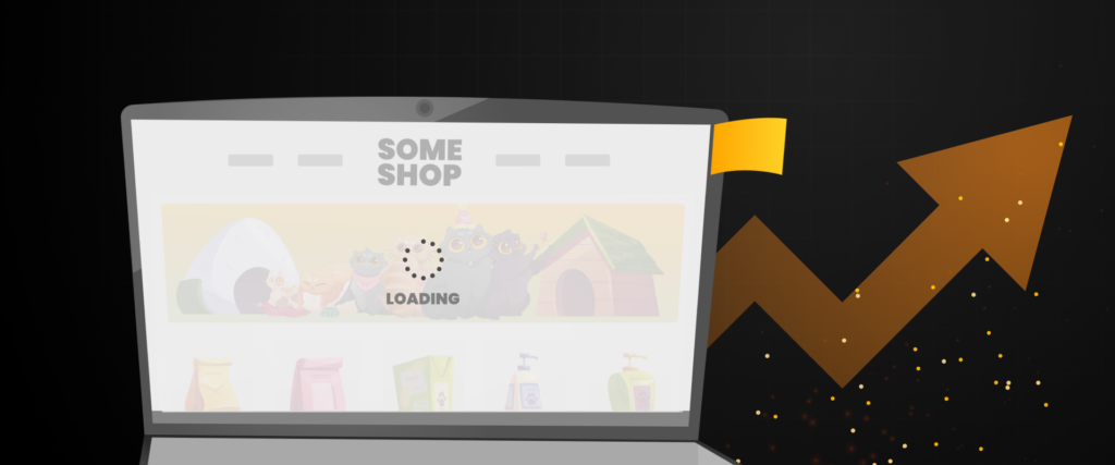
Loading speed optimization focuses on reducing the time it takes for your website to fully load. A slow website frustrates users and lowers your search engine rankings, affecting your visibility.

How to improve:
Want to speed up your website? You can do it by compressing images, minimizing code, and using faster hosting services. Also, don’t forget to leverage browser caching to reduce page load times. Remember, faster websites keep users engaged and drive more sales!
6. A/B Testing and Iteration
What is:
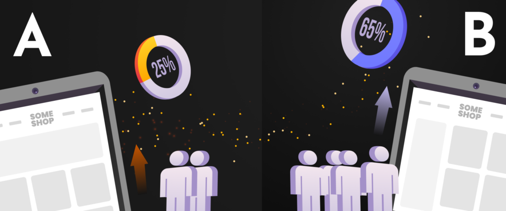
Shortly: A/B testing compares web pages or feature versions to see which performs better. Users are divided into groups and shown different versions, and interaction data is analyzed to determine the best one. Iteration and user feedback are used to continuously improve and optimize web pages and features.

How to improve:
Conduct ongoing A/B tests on key elements like CTAs, headlines, or page layouts to find the most effective version. Use these insights to continuously refine your website. This approach ensures your site stays relevant, optimized, and user-friendly, helping you boost conversions over time.
Conclusion
Understanding user behavior, simplifying navigation, optimizing mobile responsiveness, and improving loading speeds are key aspects of providing visitors with a positive experience that encourages them to explore and convert into paying customers.
The article discussed proven techniques such as creating clear calls-to-action (CTAs), ongoing improvement through A/B testing, and utilizing analytics to enhance user satisfaction. Focusing on these areas can help eliminate friction points that may deter visitors from completing a purchase or signing up.
Additionally, it is essential to recognize the importance of a professional UX audit. A comprehensive ui audit can identify and optimize weak spots in your website, leading to a more user-friendly interface that maximizes conversion potential.
Our website ux audit services offer personalized strategies to refine UX/UI, ensuring your website attracts and converts visitors. Ready to elevate your online store? Let our UX/UI audit be the first step towards enhancing your conversion rates and achieving long-term success.
